Small multiples (also called Trellis chart) is one of the most powerful data visualization methods that can vastly increase the depth of insight in your reports and dashboards. The Zebra BI Charts visual provides extensive support for small multiples in Power BI. This will help you display extremely valuable visual comparisons on a single report page.
Watch how to create powerful small multiple charts in just a few steps.
Introduction to small multiples
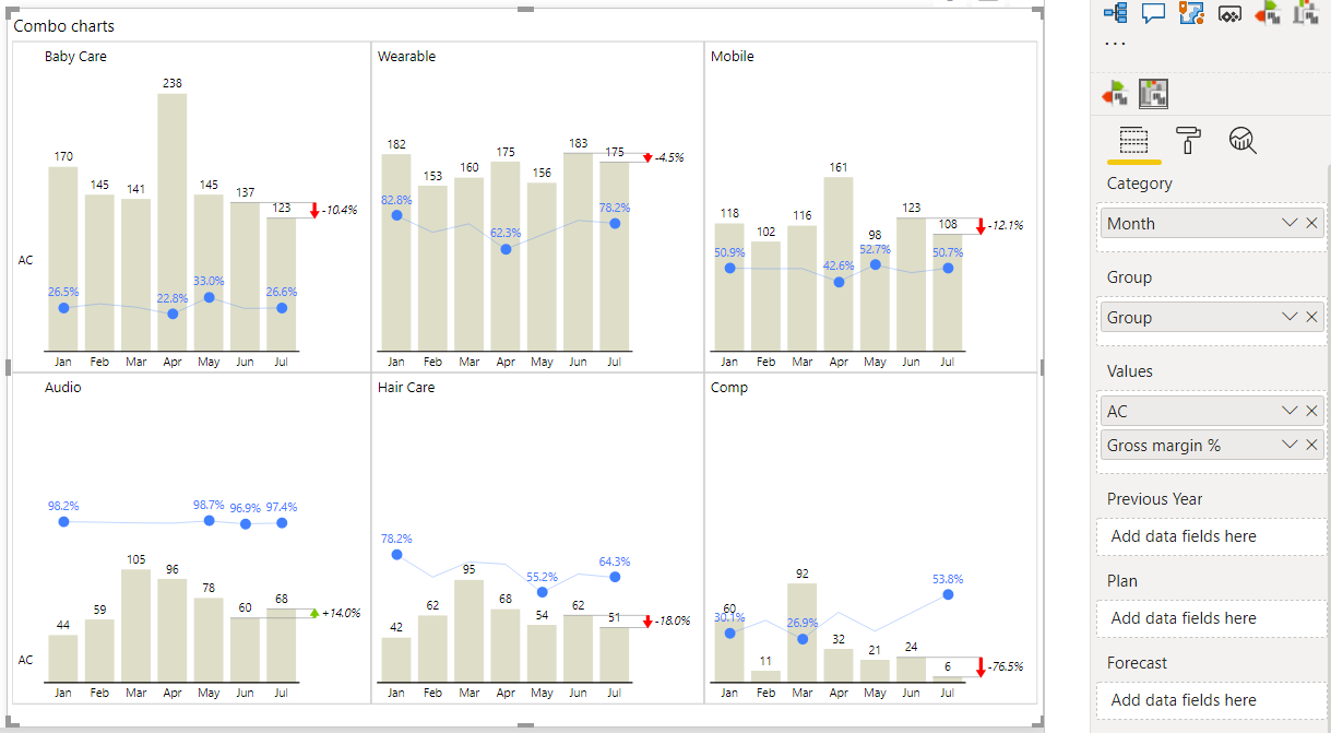
You can create small multiples from any Zebra BI chart, including combo charts, charts with forecasts, or vertical charts. It’s also childishly easy – simply put your desired data field into the Group placeholder:
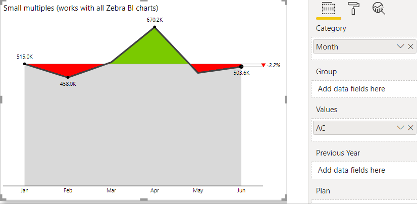
You will notice that all the charts are scaled (rendered to the same scale or in other words, the Y-axis is automatically synchronized across all the charts). This is extremely important because only properly scaled charts enable true visual comparisons between data categories. But no need to worry, Zebra BI takes care of this out of the box.
Once you’ve created your small multiples, you can change any setting on any chart and the change will be instantly applied to all the charts at once. For example, you can break the axis, change the chart type, colors, and so on:
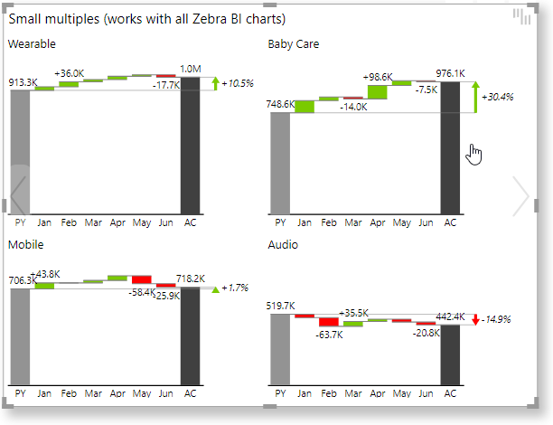
By visually comparing data categories rendered in a small multiple, the user will understand the importance of each category. Typically, some data categories will be much less important (have much smaller value), so also the chart representing it will be smaller. By clicking on the title above each chart, you can zoom into the selected category. A bigger “zoomed-in” chart will pop up so you can observe the details. When done, simply click once more to close the pop-up:
Displaying multiple charts in one single visual as opposed to simply putting several unrelated visuals to your Power BI report pages has many advantages. Apart from proper visual display due to correct scaling, this method requires significantly less work on your part.
In addition, your Power BI will become faster. Why? Because Power BI only needs to fetch the data once for Zebra BI, load only one visual, and then Zebra BI renders everything in one go. This reduces the number of visuals on your report pages, eliminates the need to fetch the data multiple times, and eliminates the need to load multiple visuals each time the page is refreshed. Result: faster overall query time, faster overall loading time, and faster overall rendering (display) time.
Below is an interactive Power BI demo so you can see small multiples in action.
Click the ⤢ icon at the bottom-right of the report page to enjoy the full-screen view.
Managing the layout of small multiples
When rendering multiple charts in one visual it is important that you have good control over the layout and display options. That’s why the Zebra BI Charts visual offers several important settings to make sure you can tweak the design for any dataset you might want to include in small multiples.
Let’s start with the Category width. You can control the width of Zebra BI charts by setting the width of a category (the number of pixels needed to represent one data point in a chart). This setting is available in the Category group of settings and is set to Auto by default. This means that Zebra BI will try to figure out the best possible chart width for typical situations. However, sometimes you will want to display more narrow or wider charts and in this case, you can switch this setting to Fixed and then set the desired number of pixels in the Min width edit box:
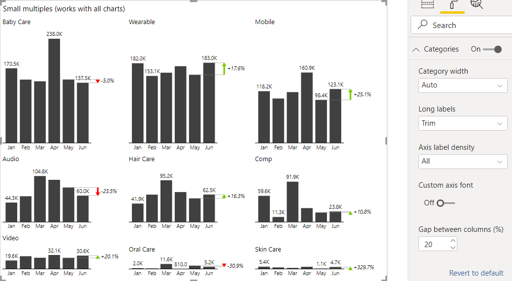
If the charts are narrower, you will squeeze more of them into a small multiple and will end up with more columns in the small multiples matrix.
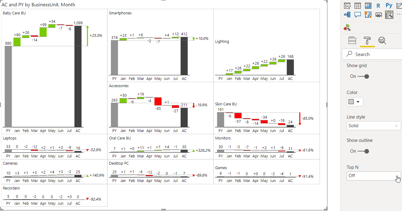
Next, you can display a grid around the charts and, more importantly, choose from three different layouts to make sure the charts are positioned in the best way possible. You can choose between Smart rows, Auto, and Largest first layouts in the Small Multiples > Layout setting. If some of your charts are much bigger than the others, then the Auto layout or the Largest first layout will probably work better.
Here’s how to turn on the grid and switch to the Auto layout:
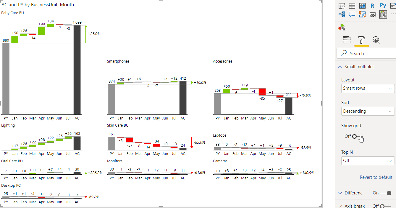
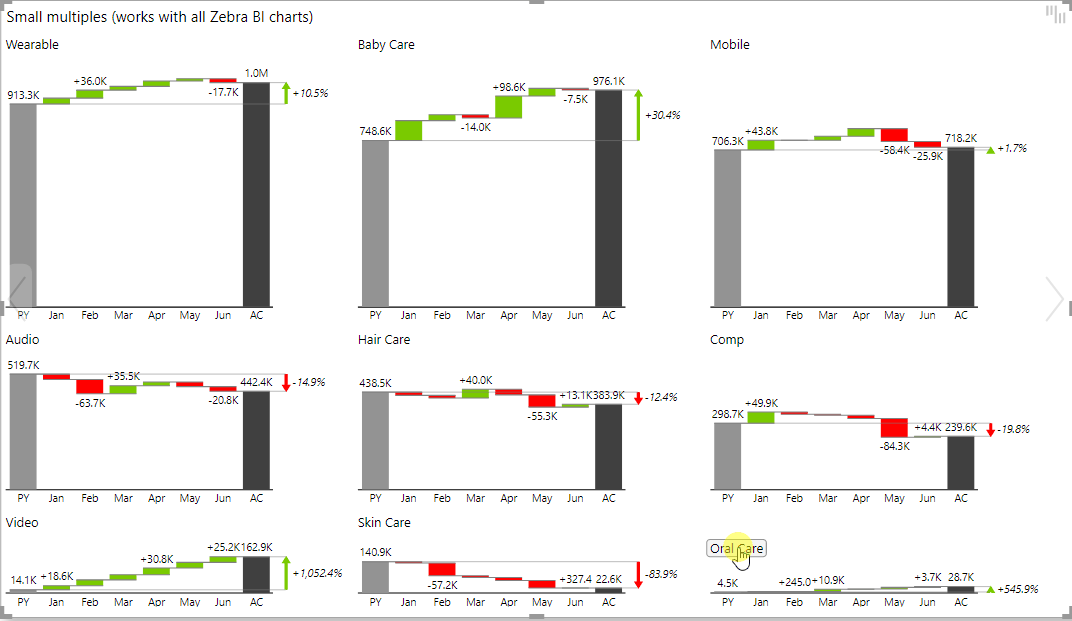
If you have a lot of elements in your data field, a lot of charts will be displayed in a small multiple. Typically, many of them will be very small and much less important. In this case, you can turn on the Top N setting to display just the top most important ones:
Zebra BI will automatically aggregate (sum up) all the other (small) charts into a new chart called “Others”, displayed as the last chart in the visual.
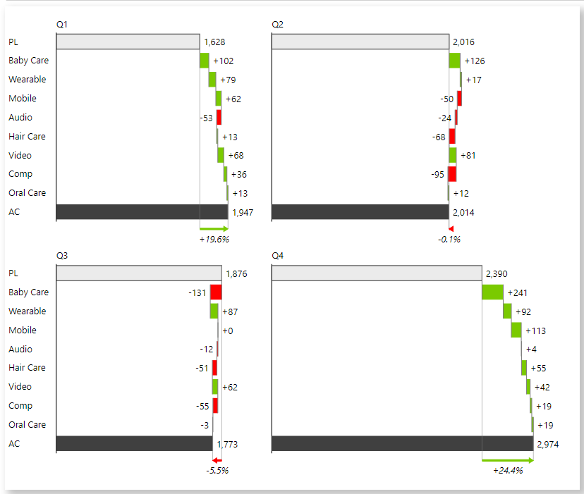
Sorting small multiples
As you may have noticed, Zebra BI sorts all the charts in small multiples descending by default. This is fine in most cases, however, you might have a situation where you need to apply your custom sort order of charts (e.g. alphabetical, by geography, or a custom sort).
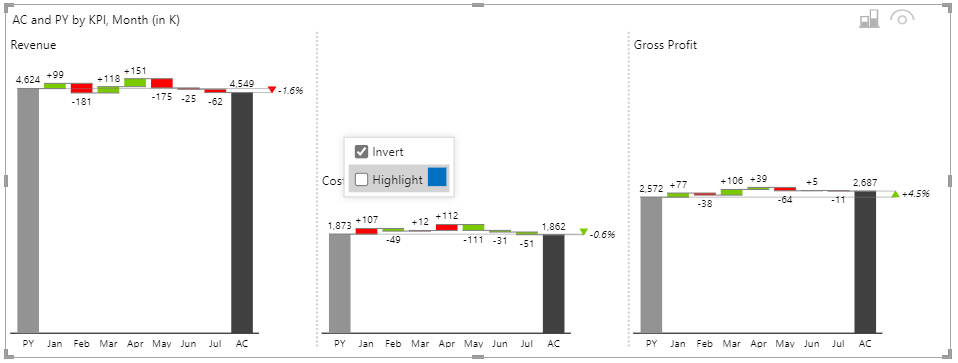
A practical example of this would be a small multiple where each chart shows a different KPI and you want the KPIs in a specific desired order, e.g. first the Revenue, then Costs, then Gross profit, and so on:
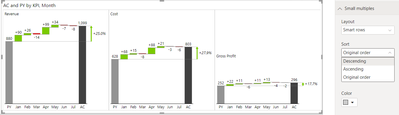
To achieve this, first, make sure that you have a correct custom order set in your Power BI model for the data field you are using for small multiples and then set the Sort setting in the Small multiples group of settings to Original order (see picture above).
This specific example is even more challenging because some KPIs in the dataset might be “bad” KPIs with a negative impact on results (e.g. costs). In the picture above, the cost is growing from the previous year (+27,9%), which is not good. The variance colors in this chart (but not in the other two) should be inverted.
No worries, we’ve got you covered! Simply right-click on the title of the chart that needs to have variance colors inverted and check the Invert checkbox:
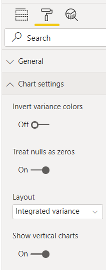
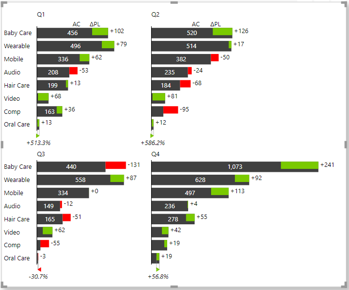
Small multiples from charts with vertical axis
The Zebra BI Charts visual allows you to create small multiples from charts with a vertical axis. Here’s an example:
To create a small multiple with charts with a vertical axis, just turn on the setting called Show vertical charts in the Chart settings:
Here’s another example, this time using integrated variance charts:
Advanced small multiple layouts
You can also create small multiples from combo charts and other chart layouts.
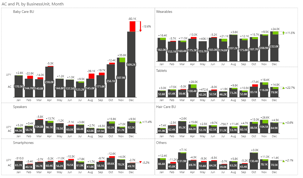
To create a small multiple with combo charts, just add a second measure to the Values placeholder. In the following example, a Gross margin in % measure has been added to the values placeholder to create a small multiple that shows sales and gross margins by business unit:
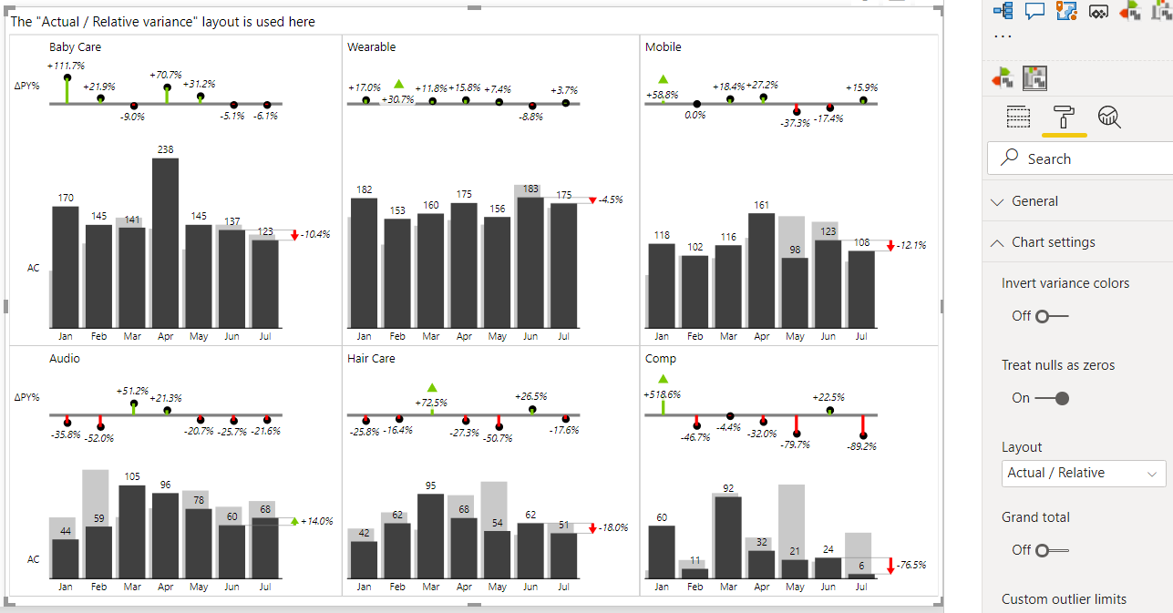
When using integrated variance charts (column charts with comparisons), you can set different layouts from the Layout drop-down menu in Chart settings. This will result in an advanced display where for example both the basic chart (e.g. actual sales and PY sales) as well as a separate variance chart will be rendered in small multiples:
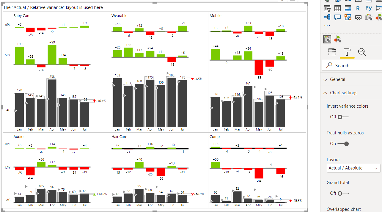
Here’s an even more complex example showing a comparison of actual vs plan vs PY with two separate absolute variance charts on top of the column charts with base values:
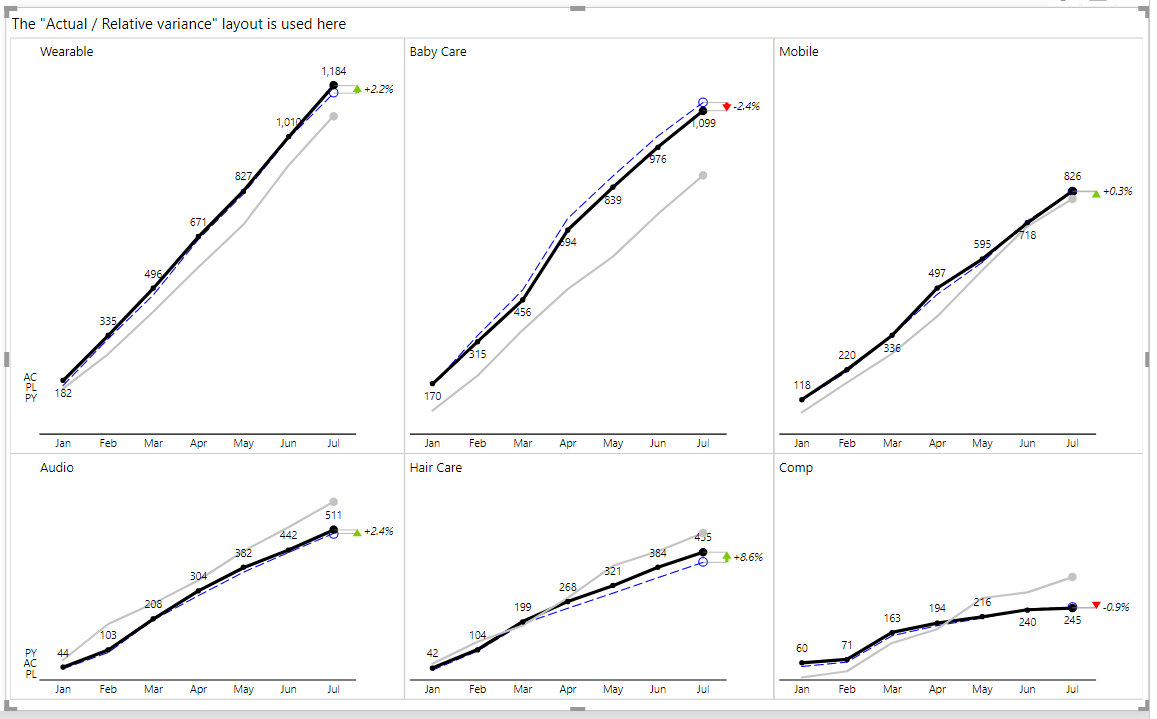
Similarly, you can show 3 data series (e.g. actual, plan, and prior year) as line charts in a small multiple. Just make sure that the lines are not overlapping too much to avoid “spaghetti charts”. For example, displaying YTD values in charts like that typically works nicely:
To conclude this article, let’s take a look at another interactive example of Zebra BI’s small multiples in action. This time 200 (!) charts are presented in one single Zebra BI visual to display daily trends of stock prices for the world’s top 200 biggest companies by market capital:
Highlighting small multiples
With this feature from the 5.1 release of Zebra BI for Power BI, small multiples have become even more flexible and your reports even more insightful. You can highlight single small multiples series with a specific color. This way you can make the most relevant group of data stand out even more clearly.
Step 1: Right-click on the Group title and select to highlight an entire series of small multiples.
Step 2: Switch to the stacked chart view where the colors will remain consistent.
Step 3: Try highlighting all the relevant series with different colors to make sure your reports are as insightful as possible.